XToolKit
XToolKit is the highest level X window interface to facilitate composing GUI (Graphical User Interface) by using GUI components such as buttons, pulldown menus, textWindows, etc., as building blocks. The major differences from the Xlib classes are, the XToolKit invokes user-supplied interaction routines corresponding to the Xevents sent from the Xserver, and provides consistent appearance of those interaction-oriented window parts. Classes consisting the XToolKit has the following inheritance structure.
xwindow
     panel
          menubar-panel
          menu-panel
          filepanel
          textviewpanel
          confirmpanel
     panel-item
          button-item
               menu-button-item
               bitmap-button-item
          text-item
          slider-item
          choice-item
          joystick-item
     canvas
     textwindow
          buffertextwindow
               scrolltextwindow
          textedit
     scroll-bar
          horizontal-scroll-bar
Just below the xwindow class are the five basic XToolKit classes: panel, panel-item, canvas, textWindow and scroll-bar. Menubar-panel and menu-panel are defined under the panel. A basic strategy to build a new application window and to make it run upon events is the following:
- define an application class An application window class should be defined as a subclass of panel that has the capability to lay out XToolKit components.
- define event handlers In the application class, event handlers that are called upon when buttons are pressed or menu items are selected are defined. An event handler ought to be defined as a method with panel-item specific arguments.
- define subpanels If you use a menubar-panel, it is placed at the top of the application window, therefore it should be created first by :create-menubar. Similarly menu-panels needs to be defined before the menu-button-items to which menu-panels are associated.
- create panel-items Panel-items such as button-item, text-item, slider-item, etc., can be created by (send-super :create-item class label object method). Event handlers defined above are connected to each panel-item. These initialization procedures should be defined in the :create method of the application window class. Do not forget to define quit button to make the event dispatcher terminate whenever needed. Any textWindow and canvas can also be placed in the application window via the :locate-item method.
- create the entire window Sending the :create message to the application class creates the application window with its XToolKit components properly placed in the window.
- run the event dispatcher In order to receive events from the Xserver and delivers them to the corresponding xwindow, run window-main-loop. On Solaris2, window-main-thread, which delivers events in a different thread, is available. Window-main-thread keeps the toplevel interaction alive. Do not run more than one window-main-thread.
X Event
In the current implementation, an event structure is received in a fixed event buffer (an integer-vector of 25 elements) and the same buffer is reused on all events. The event structure has to be copied when more than one events need to be referenced at the same time.
Window-main-loop is the function which captures all events sent from the X server and delivers them to each window where the event happened.
event **
a 25-element integer-vector holding the most recent event structure.
next-event **
stores the event structure in event and returns it if there is at least one pending event, NIL if there is no pending event.
event-type event
returns the keyword symbol representing the event-type in the event structure. The event-type keywords are: :KeyPress (2), :KeyRelease (3), :ButtonPress (4), :ButtonRelease (5), :MotionNotify (6), :EnterNotify (7), :LeaveNotify (8), :FocusIn (9), :FocusOut (0), :KeymapNotify (1), :Expose (12), :GraphicsExpose (13), :NoExpose (14), :VisibilityNotify (15), :CreateNotify (16), :DestroyNotify (17), :UnmapNotify (18), :MapNotify (19), :MapRequest (20), :ConfigureNotify (22), :ConfigureRequest (23), :GravityNotify (24), :ResizeRequest (25), :CirculateNotify (26), :CirculateRequest (27), :PropertyNotify (28), :SelectionClear (29), :SelectionRequest (30), :SelectionNotify (31), :ColormapNotify (32), :ClientMessage (33), :MappingNotify (34), :LASTEvent (35).
event-window event
returns the window object where the event occurred.
event-x event
extracts the x coordinate, (i.e., the horizontal position of the mouse pointer relatively in the window) out of the event.
event-y event
extracts the x coordinate, (i.e., the vertical position of the mouse pointer relatively in the window) out of the event.
event-width event
returns the eighth element of the event structure which represents the width parameter at the :configureNotify event.
event-height event
returns the ninth element of the event structure which represents the height parameter at the :configureNotify event.
event-state event
returns a list of keywords representing the mouse button and modifier key state. Keywords are: :shift, :control, :meta, :left, :middle and :right. For example, if left mouse button is pressed while shift key is down, (:shift :left) is returned.
display-events **
displays all xwindow events captured by x:nextevent. Control-C is the only way to terminate this function.
window-main-loop &rest forms
receives Xevents and delivers them to window objects where the event occurred. According to the event-type, methods in the window’s class named :KeyPress, :KeyRelease, :ButtonPress, :ButtonRelease, :MotionNotify, :EnterNotify, :LeaveNotify and :ConfigureNotify are invoked with event as the argument. If forms is given, evaluates them each time event arrival is checked.
window-main-thread **
Do the same thing as window-main-loop in a different thread. Window-main-thread is only available on Solaris2. Window-main-thread installs an error handler which does not enter a read-eval-print loop. After printing the error information, the event processing continues.
Panel
panel
Panel is a xwindow with the capability to lay out panel-items or any xwindows including other panel objects. A panel object supplies the default font for every panel-item created in the panel. Application windows should be defined as subclasses of the Panel.
creates and initializes a panel. Since superclass’s :create is invoked, all creation parameters for xwindow, such as width, height, border-width, etc., are allowed. Item-height and item-width give the minimum height and width for each panel-item.
:items **
returns the list of all items associated.
:locate-item item &optional x y
is any xwindow object, normally a panel-item. If x and y are given, the item is located there. Otherwise, item is located adjacent to the most recently located item. Items are located from top to bottom, from left to right, as shown in Fig. [panellayout]. :Locate-item also adds item in the items and subwindows list, and makes it visible by sending :map.
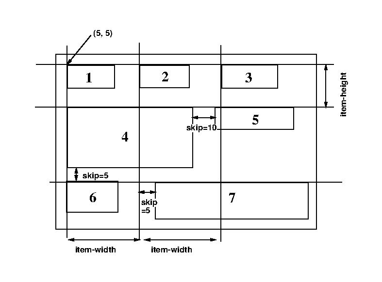
Item lay-out in panel
creates an instance of the panel-item class specified by klass (i.e., button-item, menu-button-item, slider-item, joystick-item, etc.), and place the item in the panel using :locate-item. Args are passed to klass’s :create method. Label is the identification string drawn in the panel item. Receiver and method specify the event handler called upon the corresponding event.
:delete-items **
delete all panel-items.
creates a menubar-panel and locates it at the top of the panel.
The following methods are provided to avoid “subclass’s responsibility” warning message when events are sent to panels without event handlers. User applications should override these methods.
:quit &rest a
throws :window-main-loop and terminates event processing.
:KeyPress event
returns NIL.
:KeyRelease event
returns NIL.
:ButtonPress event
returns NIL.
:ButtonRelease event
returns NIL.
:MotionNotify event
returns NIL.
:EnterNotify event
returns NIL.
:LeaveNotify event
returns NIL.
File Panel
The FilePanel is an application window for the interactive manipulation of files and directories. Using cd and go-up buttons, any directory can be visited and files contained in the directory are displayed in the ScrollTextWindow below. Text files can be displayed in different windows (textViewPanel). Files can also be printed, removed, and compiled by simply cliking buttons. When a file is printed, a2ps file | lpr commands are executed in a forked process.
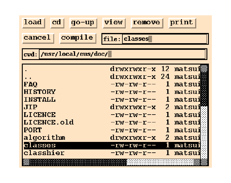
FilePanel window
Text View Panel
TextViewPanel is an application window class to display text files (Fig. [textviewpanel]). The program text is shown to demonstrate how one of the simplest application windows is described. In the :create method, the quit button and find button, and a text-item to feed the string to be searched for in the file are created. The view-window is a ScrollTextWindow that displays the file with the vertical and horizontal scroll-bars. The TextViewPanel captures :ConfigureNotify event to resize the view-window when the outermost title window is resized by the window manager.
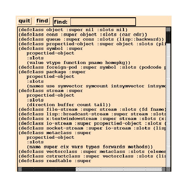
TextViewPanel window
(defclass TextViewPanel :super panel
        :slots (quit-button find-button find-text view-window))

(defmethod TextViewPanel
 (:create (file &rest args &key (width 400) &allow-other-keys)
    (send-super* :create :width width args)
    (setq quit-button
          (send self :create-item panel-button "quit" self :quit))
    (setq find-button
          (send self :create-item panel-button "find" self :find))
    (setq find-text
          (send self :create-item text-item "find: " self :find))
    (setq view-window
            (send self :locate-item
                (instance ScrollTextWindow :create
                   :width (setq width (- (send self :width) 10))
                   :height (- (setq height (send self :height)) 38)
                   :scroll-bar t :horizontal-scroll-bar t
                   :map nil      :parent self)))
    (send view-window :read-file file))
 (:quit (event)  (send self :destroy))
 (:find (event)
    (let ((findstr (send find-text :value)) (found)
          (nlines (send view-window :nlines)))
        (do ((i 0 (1+ i)))
            ((or (>= i nlines) found))
           (if (substringp findstr (send view-window :line i)) (setq found i)))
        (when found
           (send view-window :display-selection found)
           (send view-window :locate found))))
 (:resize (w h)
    (setq width w height h)
    (send view-window :resize (- w 10) (- h 38)))
 (:configureNotify (event)
   (let ((newwidth (send self :width))
         (newheight (send self :height)))
        (when (or (/= newwidth width) (/= newheight height))
          (send self :resize newwidth newheight)))  ) )
Panel Items
panel-item
Panel-item is an abstract class for all kinds of panel-item windows to invoke notify-object’s notify-method when item-specific event occurs.
:notify &rest args
invokes notify-object’s notify-method. Responsive events and arguments passed to notify-method are item specific:
- button-item
- The button is pressed and released in the same button-item; the argument is the button-item object.
- menu-button-item
- A menu item is selected; the argument is the menu-button-item object.
- choice-item
- A new choice button is selected; the arguments are the choice-item object and the index number of the choice.
- text-item
- A newline or return is entered; the arguments are the text-item object and the entire line (string).
- slider-item
- The slider nob is grabbed and moved; the arguments are the slider-item object and the new value.
- joystick-item
- The joystick is grabbed and moved; the arguments are the slider-item object, the new x and y values.
creates a panel-item. As panel-item is an abstract class, this method should only be called by the subclasses via send-super.
button-item
button-item is the simplest panel-item. Button-item has a rectangular box and a label string in it. When clicked, button-item invokes notify-object’s notify-method with the panel-item object as the only argument.
:draw-label &optional (state :top) (color bg-color) (border 2) offset
draws button-item’s label.
creates a button-item. If button’s width and height are not given, the sizes are automatically set to accomodate the label string drawn with the given font. Though the border-width is defaulted to 0, pseudo 3D representation embosses the button. The background color and font are defaulted to the ones defined for the parent window, i.e. a panel.
:ButtonPress event
changes the background color to gray, as if the button.
:ButtonRelease event
changes event’s background color to normal.
menu-button-item
defines a pulldown menu. Though a menu-button-item looks like a button-item, the menu-button-item activates associated menu-panel below the button when it is pressed, instead of sending an immediate message to the notify-object. The actual message is sent when the mouse button is released on one of the menu items.
creates a pulldown menu button. Receiver and method arguments has no effect.
:ButtonPress event
reverses the appearance of the pulldown-menu and exposes the associated menu-panel below the button.
:ButtonRelease event
unmaps the menu-panel below this button and reverts the appearance of the button.
bitmap-button-item
Though bitmap-button-item’s function is similar to the button-item, its appearance is different. Instead of drawing a simple label string on the button, as is the case for button-item, bitmap-button-item is drawn by a pixmap which is loaded from a bitmap-file when the button is created.
:draw-label &optional (state :flat) color bg-color (border 2)
draws a bitmap/pixmap on the button.
creates bitmap-button-item. The first argument, bitmap-file replaces the label argument of button-item.
:draw-label &optional (state :flat) (color bg-color) (border 2)
draw a bitmap/pixmap on the button.
:create-bitmap-from-file fname
creates pixmap from the bitmap file named fname, and stores its id in pixmap-id.
choice-item
choice-item is a set of round choice buttons. One choice is always active, and only one choice can become active at the same time. choice-item provides the similar function as radio-buttons.
create a choice-item-button. Each choice button is a circle of radius button-size. When a new choice is selected, notify-object’s notify-method is invoked with the choice-item object and the index of the choice selected.
:value &optional new-choice invocation
If new-choice is given, it is set as the current active choice, and the corresponding circle is filled black. If invocation is also specified, notify-object’s notify-method is invoked. :Value returns the current (or new) choice index.
:draw-active-button &optional (old-choice active-choice) (new-choice active-choice)
draw active button.
:ButtonPress event
If the mouse button is pressed on any of the choice buttons, its index is recorded in transient-choice. No further action is taken until the mouse button is released.
:ButtonRelease event
If the mouse button is released on the same button which is already pressed, the active-choice is updated and notify-object’s notify-method is invoked.
slider-item
While choice-item is used to select a discrete value, slider-item is used for the continuous value in the range between min-value and max-value. Each moment the value is changed, notify-object’s notify-method is invoked with the slider-item object and the new value as the arguments.
creates slider-item. The sliding knob is displayed as a small black rectangle on a bar. The left end represents the min value and the right end max value. The length of the bar stretches for the span dots. The current value is displayed to the right of the slider-item label in the value-format.
:value &optional newval invocation
If newval is given, it is set as the current value, and the knob is slided to the corresponding location. If invocation is also specified non nil, notify-object’s notify-method is invoked. :Value returns the current (or new) value.
joystick-item
joystick-item can be regarded as the two-dimensional slider-item. Two continuous values can be specified by the moving black circle on the coaxial chart that looks like a web (Fig. [panelitem]).
Stick-size is the radius of the stick’s black circle. The sizes of the circles in the coaxial chart are determined according to the width and height of the joystick-item window. If return is non-NIL, the joystick returns to the origin when the mouse button is released. Otherwise, the joystick remains at the released position.
:value &optional newx newy invocation
If both newx and newy are given, they are set as the current values, and the joystick moves to the corresponding location on the coaxial chart. If invocation is also specified non nil, notify-object’s notify-method is invoked with the joystick-item object and x and y values as the arguments. :Value returns the list of current (or new) values.
The following short program shows how to use panel-items described above, and Fig. [panelitem] depicts how they appear in a panel.
(in-package "X")
(defclass testPanel :super panel
        :slots (quit joy choi sli))
(defmethod testPanel
 (:create (&rest args)
    (send-super* :create :width 210 :height 180
                 :font font-courb12 args)
    (send-super :create-item button-item "quit" self :quit :font font-courb14)
    (send-super :create-item choice-item "choice" self :choice
                :choices '(" A " " B " " C ")
                :font font-courb12)
    (send-super :create-item slider-item "slider" self :slider
                :span 90)
    (send-super :create-item joystick-item "joy" self :joy)
    self)
 (:choice (obj c) (format t "choice: ~S ~d~%" obj c))
 (:slider (obj val) (format t "slider: ~S ~s~%" obj val))
 (:joy (obj x y) (format t "joy: ~S ~s ~s~%" obj x y)) )
(instance testPanel :create)
(window-main-thread)
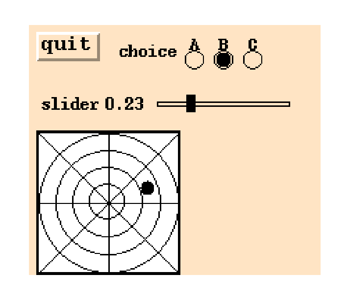
Panel items created in a panel
text-item
Text-item is used to display or to input one short line of text, such as a file name. A text-item has a label string followed by a small textwindow on the right. When the pointer is put in the textwindow, key input is enabled and the characters typed are buffered. Line editing is available in the textwindow: control-F and control-B to move forward/backward by one character, del to delete the character on the left of the cursor, control-D to delete the character on the cursor, and any graphical character to insert it at the cursor position. Clicking a mouse button moves the cursor to the clicked character. Hitting an enter (newline) key causes the buffered text to be sent to the notify-object’s notify-method.
creates text-item. Though the linebuffer of the textwindow may have unlimited length, visible portion is restricted to the columns characters.
:getstring **
returns the string in the key buffer.
Canvas
canvas
Canvas is a xwindow to interact with figures or images. Currently, only the region selection capability has been implemented. At the buttonPress event, the canvas begins to draw a rectangle with the topleft corner at the pressed position and bottomright corner at the current pointer. ButtonRelease causes the notify-method to be sent to the notify-object. Use Xdrawable’s methods to draw figures or images in the canvas.
Text Window
There are three textwindow classes, TextWindow, BufferTextWindow and ScrollTextWindow.
textWindow
realizes virtual terminals usable for displaying messages. The displayed contents are not buffered and there is no way to retrieve a line or a character already displayed in the TextWindow. Basically, TextWindow has similar capabilities to the dumb terminals, that are, moving the cursor, erasing lines, erasing areas, scrolling displayed texts, inserting strings, etc. Also, the text cursor can be moved to the position designated by the mouse pointer.
:init id
initializes idth text-window.
creates text-window. The sizes of the window may be specified either by width and height or by rows and columns. Notify-object’s notify-method is invoked when a newline character is typed in.
:cursor flag
The flag can either be :on, :off or :toggle. The text cursor is addressed by the win-row and win-col. The text cursor is displayed if flag is :on, is erased if flag is :off, or is reversed if flag is :toggle. This method must be invoked frequently whenever the character at the cursor is updated.
:clear **
clears text-window.
:clear-eol &optional (r win-row) (c win-col) (csr :on)
clears the rest of the line after the character addressed by r and c, including the character at the cursor.
:clear-lines lines &optional (r win-row)
clears multiple lines after r-th row.
:clear-eos &optional (r win-row) (c win-col)
clears the region after the character addressed by r and c till the end-of-the-screen.
:win-row-max **
returns the maximum number of lines displayable in this window.
:win-col-max **
returns the maximum number of columns displayable in this window.
:xy &optional (r win-row) (c win-col)
calculates the pixel coordinates of the character addressed by r and c.
:goto r c &optional (cursor :on)
moves the cursor to r-th row and c-th column.
:goback &optional (csr :on)
moves the cursor backward by one.
:advance &optional (n 1)
moves the cursor forward by n characters.
:scroll &optional (n 1)
scroll textwindow vertically by n lines.
:horizontal-scroll &optional (n 1)
horizontally scrolls the text by n columns.
:newline **
moves cursor to the beginning of the next line.
:putch ch
inserts the character ch at the cursor position. The rest of the line is moved forward by one.
:putstring str &optional (e (length str))
places str at the cursor position.
:event-row event
:event-col event
returns the text cursor position designated by \((x, y)\) in the event.
:KeyPress event
inserts the character entered at the cursor position. If the character is newline, notification is sent to the notify-object.
textWindowStream
TextWindowStream is an output stream connected to a TextWindow. Characters or strings output to this stream by using print, format, write-byte, etc., are displayed in the textwindow. As usual file streams, the output data are buffered.
:flush **
flushes buffered text string and send them to the textwindow. Finish-output or writing a newline character to this stream automatically calls this method.
make-text-window-stream xwin
makes text-window-stream and returns the stream object.
BufferTextWindow
maintains the line buffer representing the contents of the textwindow. Linebuf is the vector of lines. Expbuf holds tab-expanded text. Only lines displayable in the window are maintained. BufferTextWindows can be used as simple text editors which have several, often only one, lines of text. Text-item employs a BufferTextWindow as a displayable line buffer.
:line n
returns the contents of the n-th line as a string.
:nlines **
returns number of lines in the linebuf.
:all-lines **
returns the linebuf, which is a vector of strings.
:refresh-line &optional (r win-row) (c win-col)
redraws the r-th line after the c-th column.
:refresh &optional (start 0)
redraws the lines after the start-th line inclusively.
:insert-string string
inserts string at the cursor position.
:insert ch
inserts the character at the cursor.
:delete n
deletes n characters after the cursor.
expand-tab src &optional (offset 0)
is a string possibly containing tabs. These tabs are replaced by spaces assuming the tab stops at every 8th position.
ScrollTextWindow
ScrollTextWindow defines buffertextwindow with unlimited number of lines, and vertical and horizontal scroll-bars can be attached. ScrollTextWindow can handle :configureNotify event to resize itself and accompanying scroll-bar windows, and to redisplay texts. By clicking, a line can be selected.
:create &rest args &key scroll-bar horizontal-scroll-bar &allow-other-keys
When scroll-bars are needed, specify T to each keyword argument.
:locate n
displays the buffered text by placing the n-th line at the top of the window.
:display-selection selection
represents the location of the selected line. The entire seleced line is displayed highlighted.
:selection **
returns the selected line (string).
:read-file fname
reads the textfile specified by fname into the linebuf, expands tabs, and display in the window. The cursor is put at the beginning of the screen.
:display-string strings
is a sequence of lines (strings). The strings are copied in the linebuf and displayed in the window.
:scroll n
vertically scrolls n lines.
:horizontal-scroll n
horizontally scrolls n columns.
:buttonRelease event
The line where the mouse pointer is located is selected. If notification is specified when the window is created, notify-object’s notify-method is invoked.
:resize w h
changes the size of the window and redisplays the contents according to the new size. The same message is sent to scroll-bars if attached.